How To Make Sure Your Attendees Are Retaining The Most Ideas.
Even the best conference agendas are often packed with an overwhelming amount of content, causing attendees to make tough choices about which concurrent sessions to attend and which to miss.
USASBE (United States Association for Small Business and Entrepreneurship) took on this challenge while planning their 2018 conference. They wanted a way for attendees to see ALL of the session highlights, even though each person could only attend a handful of the 33 amazing sessions offered.
Together we came up with a 3-step solution:
1. Gather Content: Each session was assigned a facilitator to fill out a template that I created in advance. It asked for the session topic, how it relates to entrepreneurship, and 3 takeaways.
2. Synthesize: After each session block, the facilitators brought the templates to me to identify themes and synthesize.
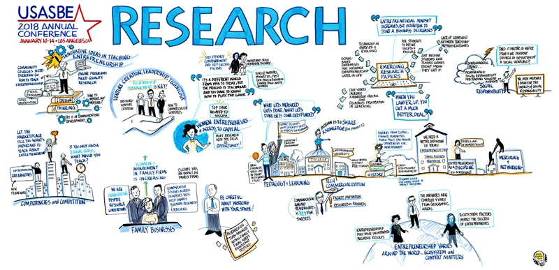
3. Draw: I took the synthesized content and created three 4’x8’ murals, one for each of the conference’s three categories: Education, Research, Programming.
The Result: Attendees can see highlights and takeaways from ALL concurrent sessions on one page. Each idea has a visual anchor, making that idea twice as easy to remember and 100 times more fun to share with colleagues.
The finished murals are USASBE’s to keep and display at their HQ. As always we delivered high-res digital files for them to share with attendees, use in their newsletter, promote on social media, and advertise next year’s conference.
There’s a unique solution for how to make every event memorable.

